USPS Redesign
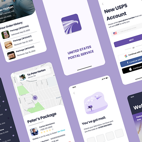
A Post Office in your pocket: highly personalized app designed for all generations, with a variety of smart services.
August 2020 - October 2020
Categories
UX/UI Design, App Design, Service Design, Brand Design
Team
Team of three with highly talented fellow students.
Role
I was responsible for UX Research, UX Design as well for parts of interaction design, user interface design incl. selected visual design elements.
Tools
Figma, Illustrator, Photoshop
Context
Even if the United States Postal Service is very reliable when it comes to mail, the government run organization is not known to be the most innovative brand on the highly competitive market. Speaking about competitors, USPS is not only under pressure because of other delivery and mailing services, it is also increasingly targeted by digital service providers who aim to digitize some of USPS business models.
With a decreasing numbers of letters sent and an increasing number of packages shipped per day, it was clear that a redesign of the current USPS app was long over due. The current app is fully functional and offers a lot of useful services, for example tracking or finding ZIP codes. However, the user interface looks slightly outdated due to 3D elements, services are limited and there is barely any space for personalization.

Key Users
Our design decisions were based on the following three personas, representing generation Z, business owners and silver surfers (the elderly):

Solution
Along with a radical redesign from the UI/UX perspective, we tried to create an entirely new look and feel of the brand with the aim to stand out and attract a younger audience while catering to existing customers with less digital literary.
As a result, we came up with a highly customizable, user-friendly and easy-to-understand app that offers a lot of benefits and extra services, such as a name-based friend's list for frequently used contacts or real-time delivery tracking of the USPS vehicle.
Visual Design

Wireframes

Prototype


